
For any vinyl collector, a considerable part of the appeal and experience is the artwork.
In many cases, album covers are classic art pieces in their own right and a significant contributor to pop culture.
Countless classic album covers are instantly recognizable; they transcend generational boundaries and form part of our collective identity as a society.
In some case, they even cross cultural boundaries and become globally recognized by millions across the world. At this point, they take on a life of their own.
The power of an album cover should not be underestimated, but we’ve lost much of its impact in the digital age. At first with the CD, of course, but in the 21st century, the once-great album cover is reduced to a tiny thumbnail image on your laptop or smartphone.
Still, such is the power of so many classic album covers that we still remember and celebrate them today. They connect with our humanity as all great art should, which is just one of the reasons I firmly believe vinyl is here to stay.
So what makes an album cover classic? Here are five classic album examples and the story behind what makes them timeless.
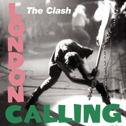
London Calling – The Clash
The third studio album by English punk legends, The Clash was released as a double album in 1979.
It reflected a desire to move beyond their punk roots and demonstrated a growing interest in styles such as reggae, ska, rockabilly, and many more.
Today, the album is considered one of the greatest rock albums of all time; some called it the best double album since the Rolling Stones, Exile on Main Street.
The album artwork is the perfect example of how an instantly recognized design can take on a life of its own.
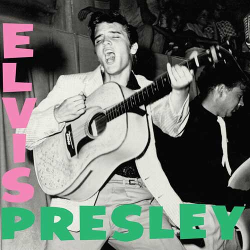
Graphic designer Ray Lowry took huge influence from Elvis Presley’s first album by applying a punk aesthetic to the same layout.
The story behind the photo is that bass player Paul Simonon was taking his frustration out on the guitar when he learned bouncers at the concert would not allow the audience members to stand up in their seats.
The photograph nearly didn’t make the cut, as photographer Pennie Smith felt it was too out of focus. But the band and Lowry saw through this to perfectly capture the spirit of punk.
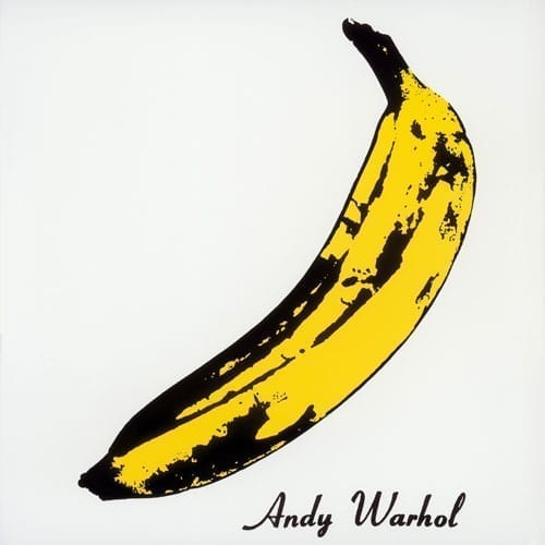
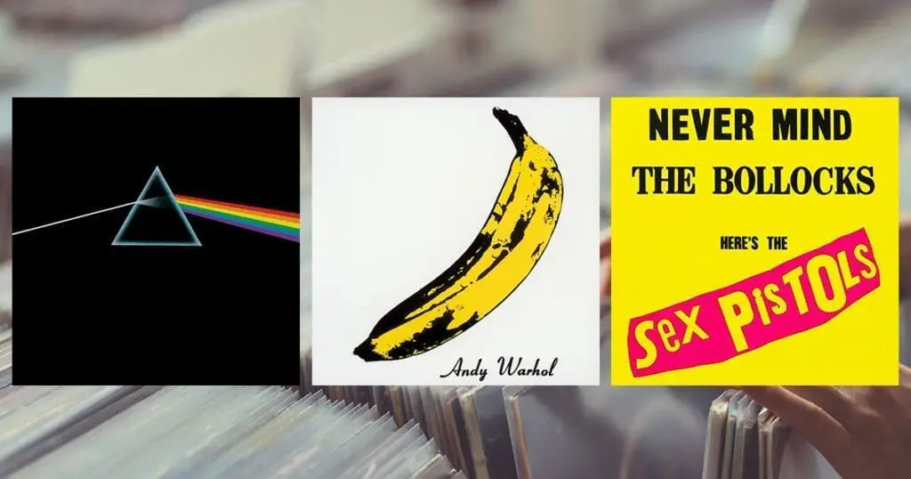
The Velvet Underground & Nico
The first Velvet Underground album featuring German singer Nico, is an example of how many records are simply ahead of their time.

The album struggled to gain acceptance from many major labels before Verve finally decided to give it a shot.
The album was just too controversial for some, both from an artistic aesthetic and a topical viewpoint. The lyrics are laden with controversial drug and sexual references and certainly played a big part in forming the 60s avant-garde sound. It was a commercial flop during its early years but eventually became recognized as one of the most influential rock albums of all time.
Famously, the band were managed and produced by pop art sensation Andy Warhol. He is credited as producing the album, although in reality, he had more influence on the album cover than the recording process.
I’d go as far as to say, if you don’t recognize this famous album cover, there’s a good chance you’ve been living under a rock!
The album cover is the famous Andy Warhol banana print. Early copies of the album invited the owner to “Peel slowly and see”. Peeling back the banana skin revealed a flesh-colored banana underneath.
The album cover is such a pop icon we still talk about it to this day; in 2008, the album was repressed on 180g vinyl, complete with the peelable banana sticker (this is the copy I own).
By combining modern art with avant-garde music, the album was both culturally revolutionary and boundary-pushing. Countless artists cite this album as a key influence; undoubtedly, the album art played a big part in its lasting success.

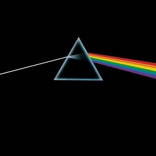
Pink Floyd – Darkside of the Moon
No classic album list would be complete without the cliche of this prog-rock giant.
This ubiquitous album has sold an estimated 45 million copies and is among the biggest selling albums ever. You don’t achieve this level of success without the complete package; great music must combine with an iconic album cover.
Storm Thorgerson (the English graphic designer and movie director) designed the famous prism album cover.
The band’s keyboardist, Richard Wright asked him, quite simply, for a “simple and bold” design.
The result was a striking image that represented the band’s famous lighting shows and the album themes, including conflict, greed, time, death, and mental illness.
Any piece of art that connects with our mortality and the human condition can stand the test of time. Dark Side of the Moon fits the bill, and in 2013, it was selected for preservation in the United States National Recording Registry by the Library of Congress.
The reason? It is now considered “culturally, historically, or aesthetically significant”.
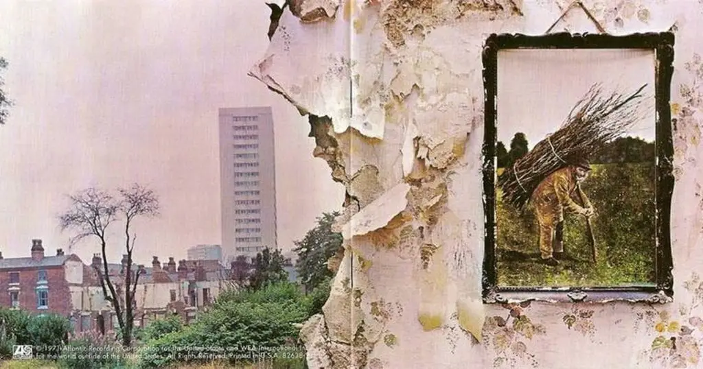
Led Zeppelin IV
Led Zep’s fourth studio album is the one most people know, least of all for the admittedly over-played Stairway to Heaven. But, hey, there’s only one way to become “overplayed,” and that’s to strike a chord (so to speak) with the masses. For a band that didn’t release singles, the ubiquity of that song is quite the achievement.
The album’s style took the band in a more ethereal direction with plenty of influence from J.R Tolkien’s Lord of The Rings.
The recording techniques are much less conventional, thanks in part to the more informal location of Headley Grange (a country house in Hampshire, England c1795). The most significant unconventional approach was to shift the drums to a large open staircase. The large open ceiling made for a huge reverberant drum sound captured with only a few microphones. The result has set the tone for big stadium rock drum sounds to this day.
The album cover art is one you have to open fully to appreciate. The front shows a 19th-century rustic oil painting that Robert Plant reportedly purchased from an antique shop. It was attached to the wall of a partly demolished old house for the photograph.
Turn around to the back (or better still, open the two so they’re visible together) and you complete the scene. The new post-war concrete tower block is Sailsbury Tower in Birmingham.
No matter what your view of post-war architecture, the cover is undoubtedly a powerful portrait of progress.

Before we move on to the next album, there is one obvious omission, the album name.
In place of a title, each band member chose a personal emblem for the cover. Robert Plant and Jimmi Page both designed their own symbols, while John Paul Jones and John Bonham took theirs from Rudolf Koch’s Book of Signs. Jones’ symbol symbolizes a person who possesses both confidence and competence. Bonham’s symbol represents the triad of mother, father, and child.
A picture tells a thousand words; there’s plenty more to explore about this album art, too much for this article alone.
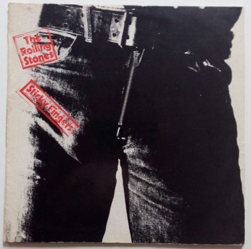
The Rolling Stones – Sticky Fingers
Sticky Fingers is one of the biggest and most recognizable Stones albums. It’s also the second album on this list to have the Andy Warhol touch. The cover shows a ‘crotch shot’ of a man in jeans (perhaps emphasizing the innuendo of the album’s title).
The original release had a working zipper that revealed an image of underwear on the inside gatefold.
As was the case back then, many controversial album covers were banned in some countries.
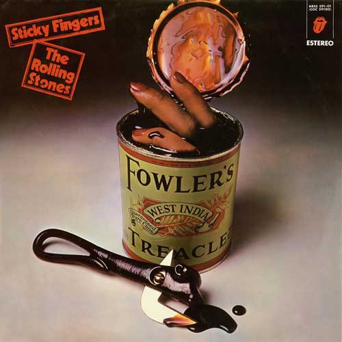
In Spain, for example, the Franco regime censored the album and replaced it with an alternative cover showing a “can of fingers”. The track Sister Morphine was also replaced by a live version of Chuck Berry’s Let It Rock.
Like most censorship, it rarely works in the long run, and it hasn’t stopped Sticky Fingers from becoming one of the most instantly recognizable classics.
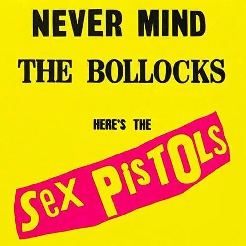
Sex Pistols – Never Mind the Bollocks
Never Mind the Bollocks is regarded by many as one the best debut albums of all time; it was also their last album, which makes its longevity all the more impressive.
It’s even more impressive given the band changed bass player part-way through the recording when the original member, Glen Matlock left and was replaced by Sid Vicious. Add into the mix the fact Sid was famously bad at playing bass, to the point where guitarist Steve Jones had to step in and play bass during the various recording sessions.
But hey, punk wasn’t about whether or not you could play, it was about attitude, shock, and shaking up the status quo.
The Sex Pistols were perhaps the epitome of punk, with their infamous bad attitude gaining them countless bans from playing live across the UK. They were also fired from two record labels. As they say, there’s no such thing as bad publicity, and today, Never Mind the Bollocks is regarded by many as the most influential punk album.
Jamie Reid is the artist behind the bold, iconic album cover whose crude newspaper cut-out style has defined much of the punk aesthetic. The brash colors clearly represent the bands in your face attitude and musical delivery.
The album was originally titled God Save Sex Pistols until it was replaced by “Never Mind the Bollocks, Here’s the Sex Pistols”. Steve Jones claims he overheard the phrase said by fans, but vocalist Johnny Rotten later explained its meaning is a working-class expression, meaning “stop talking rubbish”. The rest is music history.
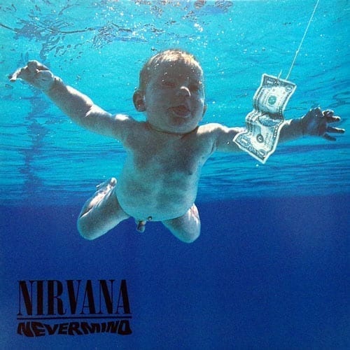
Nirvana – Nevermind
If there’s one thing everyone agrees on about Nirvana’s second studio album, it’s that it changed the direction of popular music and set the scene for a decade.
The American rock scene was dominated by ‘Hair Metal’ bands; Nevermind changed all that. The album style is a significant departure from the band’s first album in that frontman Kirt Cobain took a more commercial, melodic approach to songwriting thanks to his influences of REM, The Melvins, The Smithereens, and Pixies.
The cover, featuring a baby chasing a dollar bill while swimming in a pool of water is instantly recognizable. According to Kurt, he formulated the idea while watching a program on water births with Grohl –– it appears Kurt had somewhat of an obsession with fetuses and babies, as the theme pops up regularly in his work.
The band’s label, Geffen was concerned the visable baby penis, would cause offense, and prepared an alternate version. Kurt stated the only compromise he would accept would be a sticker covering the penis reading: “If you’re offended by this, you must be a closet pedophile.”
Speaking of which, Spencer Elden, the man who was photographed as a baby on the album cover, is currently (at the time of writing) suing the band for alleged sexual exploitation.
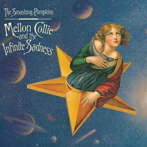
The Smashing Pumpkins – Mellon Collie and the Infinite Sadness
Thanks to the success of Nirvana’s Nevermind, the US music scene was now in the midst of a new wave of alternative and grunge rock. There would be no Smashing Pumpkins without Nevermind.
The Pumpkins’ third studio album is an ambitious double album with a vast and eclectic musical offering. It’s one of my personal favorite albums, and I kick myself for not having picked up a vinyl copy when it was re-released a few years back.
All artists have a period of peak productivity where everything they touch appears to turn golden – the Mellon Collie era is just that for the Pumpkins. Such was the output during these recording sessions, they also released an additional boxset, titled The Aeroplane Flies High. It compiled the album’s singles, each with additional songs.
In total, the boxset features approximately 30 fully completed songs from the Mellon Collie sessions; the word ambitious doesn’t even cut it!
Clearly, ambitious works need an ambitious and creative album cover.
Collage artist John Craig is the genius behind the otherworldly, antique visuals that adorn this 90s classic. There are many illustrations by Craig throughout the entire album artwork, but for the purpose of this article I will focus on the front cover.
The main cover image is very cleverly constructed from multiple images. The backdrop is an old childrens’ encyclopedia. The figurehead was pieced together from two separate artworks; the head is from Jean-Baptiste Greuze’s The Souvenir (c. 1787–1789); while the torso comes from Raphael’s painting Saint Catherine Of Alexandria (c. 1507).

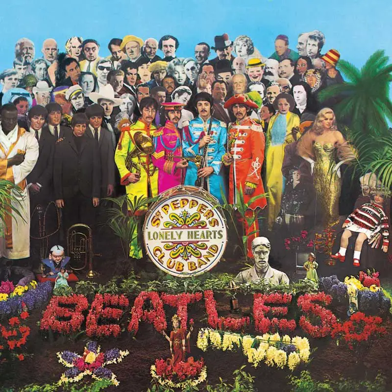
The Beatles – Sgt. Pepper’s Lonely Hearts Club Band
You could arguably take almost any Beatles album cover and it would easily make this list. However, perhaps the most iconic of all is the band’s ambitious masterpiece Sgt. Pepper’s Lonely Hearts Club Band.
Sgt. Peppers is an album cover that never fails to reveal new depth. Each time you look at the cover, you’ll likely notice something subtle and new that you’d never noticed before.
Just like a great album mix has depth and detail that reveals new elements each time you listen in-depth, the cover Sgt. Peppers is a true work of art.
Contrived by Paul McCartney, and realised by pop artist Peter Blake and his then-wife, Jann Haworth, the cover is now an iconic modern art classic.
The Beatles appear in full costume in front of an impressive backdrop of famous and iconic figures. John Lennon, Paul McCarney, and George Harrison all contributed to a shortlist of figures. But the designers, Peter Blake, Jann Haworth, and London art dealer Robert Fraser also contributed to the final list.
Controversially, John initially suggested the likes of Jesus Christ and Adolf Hitler for the cover, but both were omitted. He also initially wanted Gandhi on the cover, but it was felt this might hurt sales in India.
Those who made the cut formed a fascinating mix of cultural and political importance while also representing each individual Beatle’s unique influences.
Now Over to You!
While I’ve tried to include albums from a few different genres, any list of album covers is always going to reflect the writers taste to some degree. There are so many great classic album covers out there from across a plethora of genres. We want to hear from you! What album covers would you include? Let us know in the comments below.
Want to Display Your Vinyl As Art?
Our partners, Twelve Inch have designed a simple display solution that enables you to display your favorite records, while retaining access for playback. NO FRAMES! Using discreet magnets, you can quickly build minimalist Scandinavian style wall displays that bring any listening space to life. Check out their store, here.

Just to throw one in to the discussion to me would Alice Cooper’s Schools Out. The school desk opening up I thought was pretty cool
My top pick would be Moving Pictures by Rush, for artist Hugh Syme’s brilliant use of visual puns: from movers literally moving pictures; to bystanders being moved by the pictures; to the back cover showing them to be in a movie,! AKA a moving picture. Also of note is the use of Toronto’s Queens Park as a backdrop to pay homage to Rush’s hometown, as well as representing the three band members with its triple arches.
I’m glad to see that many of my suggestions are already listed.
Two covers that aren’t the most astounding but I’m still surprised by how many people never recognized the hidden art on Boston’s “Don’t Look Back” and on the lettering on Leon Russell’s “Will O’ The Wisp”. Both are great 1970s music too.
I’ll add my vote for ‘In The Court of the Crimson King’ and would like to add for consideration the cover of John Cale’s ‘The Academy In Peril’ Designed by Andy Warhol, the gatefold sleeve version is truly a work of great art in itself with its motif of Kodachrome slides with cutouts to the inner artwork.
The country genre is ignored in your list. I would mention Red Simpson’s Man Behind the Badge, with its ominous cop photo, Commander Cod and the Lost Planet Airmen’s Lost in the Ozone, with its iconic 60s comic cover art, and Starday Records’ series of Diesel Smoke and Dangerous Curves trucker song collections, each with truck stop themed cover art that individually and collectively offer a lively view of Americana. It would also be nice if you had an uploaf option so we could share these covers.
My all time favourite album cover (definitely not the album itself) is Blues for Allah by the Grateful Dead. The original newspaper cover for Thick as a Brick by Jethro Tull should also get a mention.
Both great classic album covers.I particularly like the Jethro Tull suggestion!
I would suggest Rage Against the Machine’s debut album. Not only did the historic photo of a Vietnamese (?) monk setting himself forewarned us as to the album’s content (incendiary), the album spanned a generation of (lesser talented) imitators.
Bitches Brew by Miles Davis – a shot across the bow for Jazz fusion and very compelling visually.
Where’s Sgt Peppers???
Not that it should make the list, but I always got a chuckle out of the fact that after such an extravagant album sleeve such as “Sgt. Pepper’s Lonely Hearts Club Band”, The Beatles went completely 180º with the sleeve for the White Album! It’s the height of minimalism. And were it not The Beatles, it could be anybody’s record inside (or test pressing!). The individual numbering was a clever gimmick, too.
A great selection of album covers, Pink Floyd have had several great ones, there are a few, I think should have made the list ahead of Smashing Pumpkins and The Sex Pistols. King Crimson In The Court of the Crimson King, Santa, from Santa’s debut album and Fleetwood Mac Mystery to Me to name a few. I could also add Judas Priest British Steel to the list.
King Crimson in the court of the Crimson King. Most times when I shop for records especially if it’s bands that I never heard of before, I look at the cover & if the cover looks good I’ll look at the musicians to see if I recognize anybody, then I’ll look at the set list of songs to see if that sparks my interest. If all checks out of & the price is Low I’ll buy it!!
Abbey Road is the most universally recognised album cover. Therefore a Classic.
Since it’s release I have seen it closely copied by Pop singers, Pop groups, Crooners, Country and Western artists, Rock groups, Jazz artists, Folk groups even Classical performers.
Always the same format, artist crossing left to right on pedestrian crossing. Not necessarily Abbey Road, but same idea. Just last week I saw a George Benson record same scene.
Hi Stuart have that George Benson album. Funny enough I only bought it for the cover and have never played it! Must give it a spin one day
Sgt. Peppers Lonely Hearts Club Band by the Beatles should also be included as it represented inclusivity of all types of music.
And a bit of British pop art!